
Sorry, Felix, this chart is unhelpful and misleading, no matter what your political predisposition.
Let’s imagine you’re a lefty. You look at this chart and think it’s great, but ONLY because you think it will help you convince ‘conservatives’ or ‘tea-partiers’ that taxes can/should go up. I would argue you have absolutely no idea whether this chart supplies a useful way to think about politics or economics. You’re thinking with your debating hat on, not your scientist hat. That means that you’re looking for something helpful and not something true.
Ok, so let’s say you’re not a lefty (not the same thing as being a righty and easily in the majority). You look at that chart and don’t give a crap. Peoples’ reaction to tax rate changes have nothing to do with sober analyses of what share of revenue the government can/should get in a society. It has to do with whether people feel like they can afford to pay more taxes or not.
This makes the chart misleading because it doesn’t address peoples’ real concerns and unhelpful because it distracts lefties from arguments that might actually work. If there are any.
The only chart that’s less useful than the one above is this doozy (or something like it):
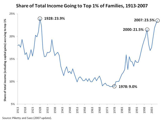
Again, a bias-confirming, load of garbage aggregate measure. Inequality is about how you feel you stack up to your neighbors. This chart does NOTHING to convince anyone that they stack up less well to anyone they know.
Populist movements arise when people feel like others are getting stuff they aren’t entitled to. That’s unfair. That’s inequality.
And right now, for whatever reason, public-sector-supported left-wing sacred cows are the poster children for getting a free ride.

“Inequality is about how you feel you stack up to your neighbors.”
This seems to be a political predisposition in itself. Your notion of Inequality is framed by your own perception of its definition.
In this case the chart above, though simple, focuses on income inequality not individuals perceived value as you seem to state.
“Income Inequality” which is more clearly defined as;-
The unequal distribution of household or individual income across the various participants in an economy. It is often associated with the idea of income “fairness”. It is generally considered “unfair” if the rich have a disproportionally larger portion of a country’s income compared to their population.
This seems to be the crux of the above chart.
Put it this way: if the data changed, would you change your mind, a la Keynes? If so, I would say that your arguments are based on the truth of these statistics. No doubt you are a highly educated and worldly person.
My view, though, is that most people don’t give a crap about statistics. They think and vote based on their everyday experience. That experience doesn’t change every time the BLS or whatever revises its aggregate data.
And I don’t think that that chart is a good indicator of what people are really experiencing in terms of inequality.
If the data set moved up or down it would defintely change my perception/bias toward income inequality.*
*I hope
Touche,
Great Blog.