The WSJ has a very interesting table of the unemployment and wage distributions for various majors. There’s lots to talk about, particularly the STEM/humanities/social/vocational divide, but one thing that struck me was that the highest and lowest unemployment rates were dominated by tiny majors. In general, small populations tend to have more widely varying outcomes just as a function of standard error, which is why you should always ignore headlines about big jumps in the crime rate for small towns. Anyway, I downloaded the data, generated some plots, and yup, it’s your classic funnel.
He then throws in some graphs:


His conclusion
Moral of the story, don’t change your major from clinical psych to actuarial science just yet. On the other hand, nursing, elementary education, and general education really do appear to be real deal outliers of low unemployment.
Putting aside how impressed I was with this analysis and how jealous I was that I didn’t think of it first, my gut said this wasn’t the last word.
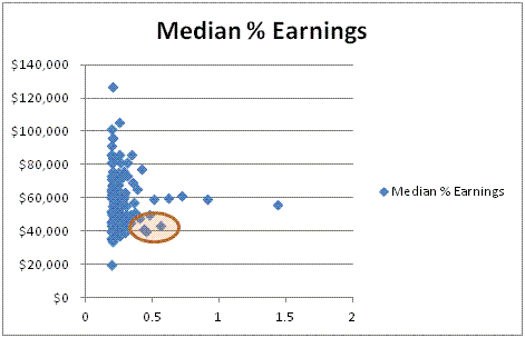
I took the data and changed the y axis from employment to median income:
And 75h percentile income:
I’ve circled two very different kind of outliers in my analysis. My little circle surrounds three majors in both images. They are:
- Elementary Education
- General Education
- Psychology
Low unemployment isn’t everything.


Do you know if the median income data contains income=0 for all of the unemployed people with that major? Or, is the income data only for those earning more than $0?
If the former, then it seems like the median data is the only graph needed (leaving aside risk aversion)
I’d be pretty surprised if the median included the 0s, so I’ll put my money on the latter.