Sorry, Felix, this chart is unhelpful and misleading, no matter what your political predisposition.
Let’s imagine you’re a lefty. You look at this chart and think it’s great, but ONLY because you think it will help you convince ‘conservatives’ or ‘tea-partiers’ that taxes can/should go up. I would argue you have absolutely no idea whether this chart supplies a useful way to think about politics or economics. You’re thinking with your debating hat on, not your scientist hat. That means that you’re looking for something helpful and not something true.
Ok, so let’s say you’re not a lefty (not the same thing as being a righty and easily in the majority). You look at that chart and don’t give a crap. Peoples’ reaction to tax rate changes have nothing to do with sober analyses of what share of revenue the government can/should get in a society. It has to do with whether people feel like they can afford to pay more taxes or not.
This makes the chart misleading because it doesn’t address peoples’ real concerns and unhelpful because it distracts lefties from arguments that might actually work. If there are any.
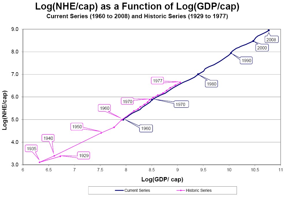
The only chart that’s less useful than the one above is this doozy (or something like it):
Again, a bias-confirming, load of garbage aggregate measure. Inequality is about how you feel you stack up to your neighbors. This chart does NOTHING to convince anyone that they stack up less well to anyone they know.
Populist movements arise when people feel like others are getting stuff they aren’t entitled to. That’s unfair. That’s inequality.
And right now, for whatever reason, public-sector-supported left-wing sacred cows are the poster children for getting a free ride.