Trends in Computing

Here is Celent on what the trends are that affect technology in insurance companies:

  • Data as platform
  • Analytics
  • Cloud computing
  • The move from server-centric architecture to service-centric architecture
  • IT security
  • Data privacy
  • Social platforms
  • User experience

Pretty boring list. And, I think, a list that doesn’t cut to the chase. Here’s my list (in order from least to most ‘social’ in nature):

  • Speed (Moore’s Law)
  • Memory: that’s disk capacity (and speed), and working memory capacity
  • Bandwidth
  • Development of user-friendly interpreted languages
  • Standards integration

To me, everything else comes from one of these trends.

Want to know what’s going to happen tomorrow in technology? Take one or more of those trends and imagine what happens when you double its current state of the art.

Don’t Want To Choke? Practice Not Choking

Great one by Barker today. Question: “How to not choke under pressure:”

Distraction (counting backwards from 100) or having adapted to self-awareness (being videotaped in prior attempts) both prevented choking:

At some level of achievement, this breaks down. Tiger Woods has more experience not choking than anybody and he does nothing but these days…

Guess even the strongest of mental fortresses crumble under the siege of domestic unrest.

This Week in Science I Don’t Understand

First story is one everyone’s probably heard:

Sept. 23 (Bloomberg) — A neutrino beam appears to have moved faster than the speed of light in an experiment whose results need to be confirmed independently, CERN, the European Organization for Nuclear Research, said.

My go-to for understanding this kind of thing is Ethan Siegel, who concludes (at the end of an excellent post, which I recommend):

Now, something fishy and possibly very interesting is going on, and there will certainly be scientists weighing in with new analysis in the coming weeks. But in all the excitement of this group declaring that they observe neutrinos moving faster than the speed of light, don’t forget what we’ve already observed to much greater precision! And be skeptical of this result, and of the interpretation that neutrinos are moving faster than light, until we know more.

Ok, we wait for more.

Next up is on genetics:

The top line finding seems to be that Europeans and East Asians are closer to each other than either is to the Australian Aboriginal. I’ve seen this result before. But, a major issue which is resolved here with their methods is that Aboriginals are closer to East Asians than they are to Europeans!

Every time I read about this the divergence of humanity seems to get more and more complicated. Perhaps this shouldn’t be surprising. The blue dots in the image below are the source genomes that were sequenced to develop the flows in red and black.

More here. Neat!

Housing

The question that I don’t have a really good feel for is to what degree the housing market is a canary or millstone. Being only 5% of the economy, one is of course inclined to think of it as a canary.

But here’s the thing: Residential construction companies employ a lot of relatively casual labor. A lot of unskilled labor. A lot of the kind of labor that is, RIGHT NOW, unemployed.

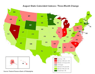
The question then is what the marginal impact of a decline in the housing market might be. One thing’s for sure, anyway. That market is completely effed right now:

In New York we’re noticing some serious signs of the residential and commercial real estate markets recovering (our rent is going up and our expanding office is having some trouble finding a home).

One can take this to mean different things. One interpretation is that there is some serious regional variation contained in these graphs, which appears to have some weight

Philly Fed State Conincident Map
Another possibility is that I don’t know what I think I know because most data is actually just BS.

The problem with new Keynesian economists is that they believe the government data for inflation, real wages, etc, actually measures the theoretical concepts that the model tries to address. But they don’t. Even NGDP is far from perfect, but at least it’s not as distorted as the CPI.

That’s Scott Sumner defending his use of NGDP because it’s the least BS stat out there. I’m heavily persuaded by this kind of argument. A little while ago, I posted something similar to this and actually got into a comment discussion, which is a rather novel thing for me here.

I feel like educated folks tend to make decisions with the part of their brains they trained in school, the part that’s wired for analysis on a given dataset and coming up with The Right Answer is the challenge.

Big contrast to real life. If you had described my job to me when I was a student, I’d imagine myself slogging through difficult math and trying to figure out how to optimally process a dataset. No so. In fact, I’m not sure I’d really want that job or be anywhere near as good at it as I feel I am at this one.

I actually spend about 75% of my time trying to figure out whether this steaming datapile is in ANY way useful. The analytical part is usually pretty straightforward. It has to be. Heck, the rest of my job is trying to shoehorn this datapile into an analysis everyone can understand instantly.

Clients are distracted, busy people and they’d say my work is important but they are often juggling a lot. My complexity test, therefore, goes like this: can this analysis be explained to a child?

And that’s as it should be. Fancy models have their place, but only when used to support conventional wisdom and gut instinct. Counter-intuitive, Complex and Useful: pick two.

I often get the feeling that macroeconomics in particular is a bit too counter-intuitive for its own good. Practitioners get wrapped up in their models and don’t spend quite enough time understanding exactly what is and is not BS. As a result, they have very weak intuition. I suspect they’d be pretty freaked out if they went down to the sausage factory and had a look.

Progress And Unreliable Sponsors

Here’s Jeff Masters.

NHC director Bill Read stated in a interview this week that had Hurricane Irene come along before the recent improvements in track forecasting, hurricane warnings would have been issued for the entire Florida, Georgia, and South Carolina coasts. At an average cost of $1 million per mile of coast over-warned, this would have cost over $700 million.

Wow. The article goes on to lament the potential budget cuts to the NHC that threaten further improvement in this forecasting system.

But this isn’t really ‘pure science’ in the classic sense: there’s a genuine commercial application for the stuff the NHC puts out. As Masters points out, $700m is not a small number.

I guarantee that some kind of private (re)insurer consortium would step in to fill the funding gap in this research budget were credibly threatened. They’re a group that can easily measure how much money is on the table to lose.

Heck, I’d bet that the budget would increase.

Down With Crap Research

Here is a post on demographics. CalculatedRisk sums it up well:

This is probably another reason many boomers will never retire

I agree with the general sentiment here, but will quibble nonetheless.

The study correlates one-year trailing P/E to the ratio of Middle-Aged over Old People (sounds a bit juvenile putting it that way). They calibrate this relationship and project the P/E ratio over the next few years. I have a few comments

  1. I generally dislike statistical models. They are prone to many biases.
  2. I dislike statistical models that adopt point estimates for variables even more. In this case, I have little doubt the modelers have non-stationary data. That means that these folks aren’t accounting for changes in variable relationships.
  3. Then there’s this graph:

Ok, now I’m pissed off. What on earth are they doing taking the log of the age ratio? What is non-linear about an age ratio? Oh, wait, let me just flick down to the footnotes to find the explanation for this unexpected and important assumption.

[crickets]

What does taking the ln of the age ratio do? Well, luckily they offer up their data and I compared the log data and the ‘raw’ data. Logarithms matter, folks:

Back to #1 above for a sec. Russ Roberts has this fantastic idea that every scientific study should be published with a little appendix showing all of the dead ends and false leads the researchers spun their wheels on.

I wonder how many different ways these researchers crunched this (these!) data before they found a proposition that fit their conclusion. Did they write up the report before they even conducted the analysis?

Anyway, even garbage research can tickle my bias and make me think for a sec. In this case CalculatedRisk has the right tack, which has been expanded upon by WCI. Boomers aren’t retiring.

Great, but yawn. Heard that before.

I’m drawn back to one of the irritating things about that previous analysis. If the boomer retirement party is postponed, what was the reverse effect back in the 90s when they were peaking in productivity?

Back to WCI, for a Canadian take:

Declining employment levels of their elders is the answer. Early retirement. Poor boomers won’t have it as good as those they displaced.

The thing with Tsunamis is that, just before they strike, they suck all of the water off the beach. Then, as we all know about big waves the water pulls back from the force of the retreating water. Boomers can’t help but push their adjacent demographic groups out of the workforce.

Hurricane Irene

I’m watching this situation pretty closely for all kinds of reasons. It’s not often my professional and personal interests coincide.

Best resource, hands down, is Jeff Masters’ blog. The source of all the raw analysis is the National Hurricane Center.

The latest modeling is annoyingly inconclusive.

I’m going to focus on New York, because that’s where I live. (In general I’d say the Carolinas are effed and most of Jersey is in for a beating)

There are three scenarios for New York, all of which seem plausible from that modeling output.

  1. If the storm stays inland and heads over the Pocono mountains, we get some serious flooding and damaged countryside, but nothing too crazy. The storm weakens considerably and the wind dies off.
  2. Toss up over which of the next two is worse: if the storm goes straight across the Carolinas and streaks along the coast, we’ve got a problem in the city. This means that all of the coastal areas (ie the most vulnerable to storm surge) get battered and (AND) the warm water keeps the storm strong. NY will probably get flooded right up to 14th street, I get evacuated from Battery Park City and it takes days for the Subway system to drain.
  3. Door #3 has the storm veer off into the ocean, really really power up and hammer (absolutely clobber) Long Island. This will have the worst wind damage, though Jersey and NYC will probably be spared. Next up is Cape Cod and Nantucket. These probably get a big helping of Hurricane winds, too.

Using this, I’m trying to handicap the models and am having some serious trouble. I’ll probably keep updating this post as the day wears on.

Edit 1:

I keep saying Carolinas, but I really mean North Carolina and Virginia

Edit 2:

Wowee. Jeff Masters gives us lots to think about. A few key points:

  • They eyewall has collapsed, which means higher pressure and a less powerful heat engine. We’re in the endgame, so rapid, massive intensification is unlikely now.
  • Wind shear, hurricane Kryptonite, is moderate (note on pic: red line is direction relative to storm track, I think, and blue is speed) but doesn’t seem to be having a big effect.
  • This sucker is a monster, which means more storm surge, damage potential measured at an eye-popping 5.1/6.
  • Masters gives a 20% chance of topping Manhattan’s flood walls and filling the Subway system with seawater.
  • Wind damage likely won’t be a big deal, now. The heaviest winds are East and out to sea (sorry, Long Island!), but aren’t crazy-strong, just strong.
  • Probability of big winds in NYC has plummeted
  • Get ready for blackouts

Personally, I’m scheduled to fly to Florida tonight for a wedding in the Jacksonville area tomorrow. 20% chance of complete flooding is probably high enough to evacuate and fleeing to the Hurricane’s wake is probably my best bet.

How and in what manner I get back is the trick.

Edit 3:

Well, looks like I’m outta here. From my building management:

The NYC Office of Emergency Management is strongly advising all residents of Battery Park City to evacuate today.  While the evacuation is not mandatory at this time, it seems clear that it will become mandatory at some point today or tomorrow.  Since the MTA is going to shut down at some point tomorrow, we strongly urge everyone to make immediate arrangements to evacuate now.

To JAX!

Baiting ‘Conservatives’

The central finding is this: people who win large amounts are just as likely to end up bankrupt as people who win small amounts. People who win a large amount, $50,000 to $150,000, have a lower bankruptcy rate immediately after winning but a higher bankruptcy rate a few years later so the 5-year bankruptcy rate for the big winners is no lower than for the small winners.

Amazingly, by the time the big winners do go bankrupt their assets and debts are not significantly different from those of the small winners. The big winners who ended up bankrupt could have paid off all of their debts but chose not to.

Here’s the link.

Yikes. Read a conservative-type person this and prime them into ‘far’ mode by linking this to income transfers, entitlement spending and welfare receipts. I dare you.

What’s the sympathetic view? Professional athletes that are too trusting and get taken advantage of? Mike Tyson?

A bit harder to pull off.

Astronomers Before Telescopes

That’s my metaphor for describing economic growth theory.

So what’s the problem? Not enough reliable data.

Let’s say there are millions of interdependent variables that contribute to the economic growth (and measurement of even these is often royally screwed up).  But you have only hundreds of observations in which to evaluate whether a particular combination of circumstances worked. Is that science? No way.

And yet, all this whining is no substitute for plausible answers is it. We want to know how to grow!

So bring on the smorgasboard of cognitive bias.

Easterly and Roberts focus on a few of these biases, for instance leadership bias (ie looking for heroes bias), which is one I particularly dislike. They link this to the technocrat’s fantasy: “imagine you were the sole adviser of an absolute dictator. What good you could do with that power!”

The bottom line from E&R’s discussion is that autocracies produce a greater variance of growth outcomes. One interesting observation was that variance is not just between leadership regimes, but within the same regime. So yesterday’s stars are tomorrow’s dogs when the growth ‘miracle’ inevitably falters.

And it’s not really a surprise: what does a dictator care about most? Staying in power (the minute he leaves he’s either going to the Hague or the hangman). Is economic growth the best way of doing this? No, doing favors for the military is the best way of doing this.

Anyway, the entire field is a technocratic aphrodisiac. You can tell how exciting the prospect of having “the answer” is when the titans of policy commentary get super upset with their lack of influence.

But limiting an individuals’ influence is the whole point. If you’ve really invented a telescope, everyone will start using it on their own.

“Measuring Unobservable Risk”

That is a paraphrasing of the title of an article in an issue of CFA magazine I found around my apartment. It caught my attention. Particularly because I’m inclined to think anything that makes that sort of claim is either BS or dangerously misleading.

So here’s the mechanism to the ‘omega-score’:

  1. Correlate returns data to ‘operational issues’ (“These include criminal, civil, and regulatory issues.”) disclosed in a regulatory filing *some* hedge funds have to make.
  2. Establish that funds with these issues perform poorly. No surprise. They use something called ‘canonical correlation‘, which assigns weights to a set of variables (‘operational issues’) and tests their weighted effect on returns. Without reading the paper, it’s tough know what the ‘omega-score’ is, but it’s probably some kind of representation of the correlation.
  3. Now find some data that is publicly disclosed by all hedge funds. These are the new variables.
  4. Test various correlations that match the profile of the #2 variables. This is how we set some kind of statistical equivalence between the variables we know have an effect on the returns (from #1) and those we suppose have an effect (the ones that are always disclosed).

That ‘canonical correlation’ thing is a clever technique that I don’t know much about. One thing to watch out for is that we’re talking about establishing a statistical artifact that has no direct intuitive basis.

In other words, there’s a difference between saying “hey, I think that these two or three variables will have an effect on returns” and saying “hey, these variables might be related to these other variables that probably have an effect on returns”. Gets messy.

And the focus is a bit confusing. What we’re really doing is correlating ‘operational issues’ with variables that heretofore had not been associated with that kind of nastiness. If I’m right that that’s what we’re doing, I’d have two questions:

  • Why do we need to do this for each fund individually? If variable x is associated with bad behavior at one fund, wouldn’t it be similarly associated at another?
  • Aren’t the findings of the correlation study interesting in of themselves? If you can get better at figuring out which funds are in legal trouble, why risk building a statistical white elephant trying to link it to returns results?

Anyway, really interesting stuff. This kind of study demonstrates the power of even modest bits of information if they’re consistently and universally disclosed.