“They were running the biggest start-up in the world, and they didn’t have anyone who had run a start-up, or even run a business,” said David Cutler, a Harvard professor and health adviser to Obama’s 2008 campaign, who was not the individual who provided the memo to The Washington Post but confirmed he was the author. “It’s very hard to think of a situation where the people best at getting legislation passed are best at implementing it. They are a different set of skills.”
That about sums up what the whole Health Exchange fiasco is about. Who put who in charge of this, anyway?
In the end, the economic team never had a chance: The president had already made up his mind, according to a White House official who spoke on the condition of anonymity in order to be candid. Obama wanted his health policy team — led by Nancy-Ann DeParle, director of the White House Office of Health Reform — to be in charge of the law’s arduous implementation. Since the day the bill became law, the official said, the president believed that “if you were to design a person in the lab to implement health care, it would be Nancy-Ann.”
More here. I have this theory that everyone makes the same decision the first time they come upon an IT project. Can’t be that hard, right? Find someone you trust and put them in charge.
And there’s this from an MR comment:
A lot of focus has been on the front-end code, because that’s the code that we can inspect, and it’s the code that lots of amateur web programmers are familiar with, so everyone’s got an opinion. And sure, it’s horribly written in many places. But in systems like this the problems that keep you up at night are almost always in the back-end integration.
The root problem was horrific management. The end result is a system built incorrectly and shipped without doing the kind of testing that sound engineering practices call for. These aren’t ‘mistakes’, they are the result of gross negligence, ignorance, and the violation of engineering best practices at just about every step of the way..


 .
.
 .
. . Remember that
  is the mean of the sample group. What we’re going to find is that it’s equal to this:
![E[\frac{1}{(k-1)}\sum\limits_{j=1}^k(Y_j-\bar{Y})^2] = \sigma^2](https://s0.wp.com/latex.php?latex=E%5B%5Cfrac%7B1%7D%7B%28k-1%29%7D%5Csum%5Climits_%7Bj%3D1%7D%5Ek%28Y_j-%5Cbar%7BY%7D%29%5E2%5D+%3D+%5Csigma%5E2&bg=ffffff&fg=303030&s=0&c=20201002) .
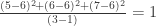
.![= \sum\limits_{j=1}^k[(Y_j-\mu) + (\mu-\bar{Y})]^2](https://s0.wp.com/latex.php?latex=%3D+%5Csum%5Climits_%7Bj%3D1%7D%5Ek%5B%28Y_j-%5Cmu%29+%2B+%28%5Cmu-%5Cbar%7BY%7D%29%5D%5E2&bg=ffffff&fg=303030&s=0&c=20201002) . We start with one of the oldest tricks in the book. Adding and subtracting the same amount from the equation.
. We start with one of the oldest tricks in the book. Adding and subtracting the same amount from the equation.![= \sum\limits_{j=1}^k[(Y_j-\mu)^2 + 2(Y_j-\mu)(\mu-\bar{Y})+ (\mu-\bar{Y})^2]](https://s0.wp.com/latex.php?latex=%3D+%5Csum%5Climits_%7Bj%3D1%7D%5Ek%5B%28Y_j-%5Cmu%29%5E2+%2B+2%28Y_j-%5Cmu%29%28%5Cmu-%5Cbar%7BY%7D%29%2B+%28%5Cmu-%5Cbar%7BY%7D%29%5E2%5D&bg=ffffff&fg=303030&s=0&c=20201002) . Expand the square.
. Expand the square.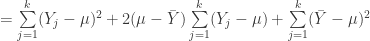 . Split up the summations.
 Recognize that a sum of means is k*the mean.
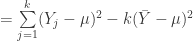 . Simplify a bit. This is a pretty key step, actually, because now we see that the sum of squared error (the left hand side, which I’ve restated here for clarity) is smaller than the sample squared errors using the true mean, mu.
![E[\sum\limits_{j=1}^k(Y_j-\bar{Y})^2]](https://s0.wp.com/latex.php?latex=E%5B%5Csum%5Climits_%7Bj%3D1%7D%5Ek%28Y_j-%5Cbar%7BY%7D%29%5E2%5D&bg=ffffff&fg=303030&s=0&c=20201002) =
= ![E[\sum\limits_{j=1}^k(Y_j-\mu)^2 -k(\bar{Y}-\mu)^2]](https://s0.wp.com/latex.php?latex=E%5B%5Csum%5Climits_%7Bj%3D1%7D%5Ek%28Y_j-%5Cmu%29%5E2+-k%28%5Cbar%7BY%7D-%5Cmu%29%5E2%5D&bg=ffffff&fg=303030&s=0&c=20201002) . Take the expectations. Boy, don’t those look like variances?
. Take the expectations. Boy, don’t those look like variances? Yep.
Yep.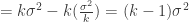 The home stretch.
